Specialty Finishes That Make
Your Print Pieces Impossible to Ignore
Your Print Pieces Impossible to Ignore
If it feels expensive, it feels valuable.
That doesn’t always mean shiny coatings or flashy tricks. Sometimes, it’s the structure. The paper. The way a piece unfolds in your hands. Some finishes add polish. Others completely change how a piece is experienced.
Because here’s the truth:
The most memorable print pieces don’t just look different—they behave differently.
Why These Finishes Work (and Why They’re Worth It)
Most print is flat. Predictable. Easy to ignore.
The moment something:
- opens in an unexpected way
- has weight or texture
- reveals itself in layers
it slows people down.
And that pause? That’s where your message actually lands.
These kinds of finishes don’t just decorate your piece—they create an experience.
The Finishes That Actually
Make People Pay Attention
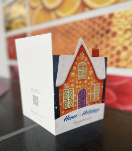
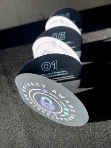
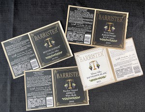
Die Cutting: Break the Rectangle
Standard shapes are easy to overlook. Die cutting changes that instantly.
Custom shapes, cutouts, windows—these make your piece feel designed on purpose, not templated.
Think:
- A postcard shaped around your logo
- A reveal window that teases what’s inside
- Packaging that feels custom before it’s even opened
Why it works:
It disrupts expectations. And in a stack of rectangles, that’s everything.
Unique Folds: Turn Print Into Interaction
A flat sheet can only do so much. A smart fold turns it into a journey.
Gate folds, accordion folds, roll folds—each one controls how your message is revealed.
Think:
- A dramatic open that builds anticipation
- A step-by-step reveal for storytelling
- A compact piece that expands into something bigger
Why it works:
People don’t just see your content—they engage with it.
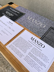
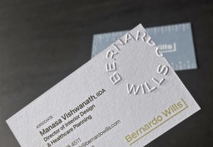
Premium Papers: The Subtle Power Move
Before someone reads a word, they feel the paper.
Weight. Texture. Rigidity. That first impression is doing more work than you think.
Think:
- Thick, uncoated stocks that feel substantial
- Subtle textures that add depth without distraction
- Unique finishes that elevate without overpowering
Why it works:
It signals quality immediately—without saying a thing.
Foil Stamping: Add Contrast, Not Noise
Foil isn’t about making everything shiny. It’s about strategic contrast.
A hint of metallic against a matte stock can do more than a fully coated piece ever could.
Think:
- A logo that catches light at just the right angle
- Minimal accents that feel intentional, not loud
Why it works:
It draws the eye exactly where you want it.
Embossing & Debossing: Make It Physical
Print is one of the few mediums people can actually feel—so use that.
Raising or pressing elements into the page adds a level of craftsmanship that’s hard to ignore.
Think:
- A logo you can feel before you even look
- Subtle patterns that add dimension
Why it works:
It turns a visual into something tactile—and that sticks.
White & Specialty Inks: The Unexpected Flex
This isn’t an everyday choice—and that’s exactly the point.
Using white ink (especially on darker or clear stocks) or specialty inks can create effects that standard printing just can’t touch.
Think:
- White ink on black paper for a high-contrast, ultra-clean look
- Layered effects where ink sits on top of the material instead of blending in
- Subtle, almost hidden design elements that reveal themselves depending on light and angle
Why it works:
It feels different because it is different. Most print relies on the paper to provide the white—so when the ink itself becomes part of the effect, people notice.
The reality check:
This is a more specialized application. It works best when the design is built around it—not added in at the last minute.

TL;DR
- Memorable print isn’t just visual—it’s physical and interactive
- Die cuts and folds create engagement, not just decoration
- Paper choice quietly communicates quality
- Foil and embossing work best when used with restraint
- The goal isn’t more finishes—it’s smarter ones
Thinking About Elevating Your Next Piece?
We’ll help you choose the right combination—based on your goals, your audience, and your budget.
Because the best print pieces don’t just get noticed.
They get remembered.
CALL LAWTON TODAY
509-534-1044
When These Finishes
Make Sense
Not every project needs to be overbuilt. But when the moment matters, these details pay off.
Use them when:
- First impressions are everything
(Business cards, welcome kits, brand launches) - You’re selling something high-value
(Real estate, premium services, luxury products) - You need to stand out physically
(Direct mail, event materials) - You want people to keep the piece
(Not just glance and toss)
Because in these moments, perceived value = actual value.
When They Don’t
Let’s keep it practical.
Skip specialty finishes when:
- It’s high-volume and short-lived
- Budget is better spent on reach or frequency
- The design is already doing too much
- The audience won’t notice (or care)
And most importantly:
Adding every finish doesn’t make something better—it just makes it busy.
The Real Advantage:
Thoughtful > Flashy
Anyone can add effects.
But the pieces people remember?
They’re the ones where everything feels intentional.
- The fold reveals the message at the right moment
- The paper reinforces the brand
- The finish highlights—not competes
That’s the difference between something that looks nice…
…and something that actually works.